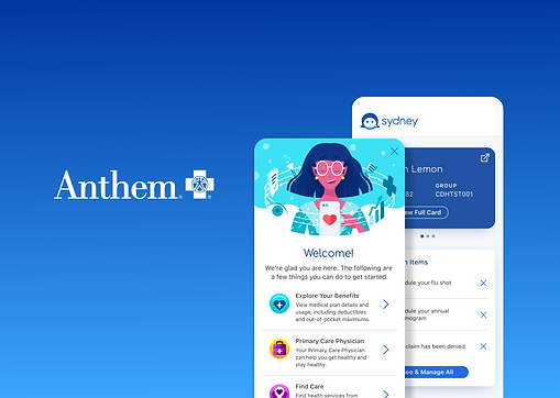
Project: One App
The project involved consolidating seven separate medical mobile applications into a single, streamlined platform. This initiative required collaboration with multiple state governments to ensure compliance with regulations and address regional healthcare needs. The primary objectives were to improve usability, enhance accessibility, and provide a more seamless experience for patients and healthcare providers.
User Testing Overview:
User testing was conducted before and after the relaunch to assess the impact of the redesign. The key metrics measured included task success rate, user satisfaction, accessibility compliance, and overall usability.
Tools
Figma
Adobe Photoshop
My Role
Senior Product Designer
Worked with product managers, stakeholders, and developers to improve the user experience through research. Gathered feedback, analyzed insights, and created user flows, wireframes, and high-fidelity mockups to enhance usability.
Timeline
1.5 Years
Pre-Relaunch User Testing Results
-
Task Success Rate: 62%
-
Average Time to Complete Key Tasks: 3m 45s
-
User Satisfaction Score: 5.2/10
-
Accessibility Compliance: WCAG 2.0 Level A
-
Common Issues:
-
Navigation inconsistencies across the seven apps
-
Users struggled to locate key features such as appointment scheduling and prescription refills
-
Poor performance and frequent crashes
-
Inconsistent branding and UI elements leading to confusion
-

Design Process


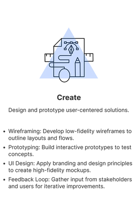
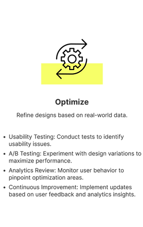
Opportunity
Consolidate multiple mobile applications into a single, efficient, and reliable platform that serves the diverse needs of our users, including both commercial plan members and Medicaid beneficiaries. By unifying these applications, we aimed to streamline access to essential healthcare services, enhance usability, and ensure a seamless experience for all users. This integration not only simplifies navigation and feature accessibility but also improves performance, reduces redundancy, and provides a more cohesive digital healthcare experience.

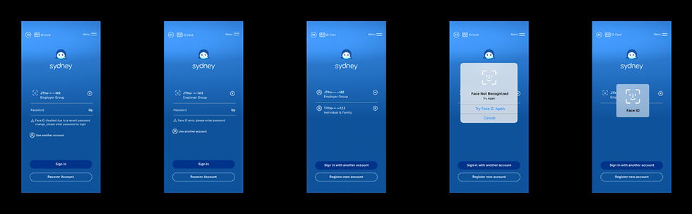
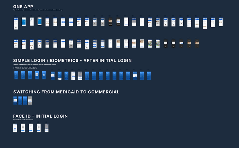
ONE LOGIN FOR ALL
As part of the consolidation of all seven mobile applications, we faced a critical challenge: distinguishing between users enrolled in Employer/Individual Plans and those covered by Medicaid. This distinction was particularly important for our state stakeholders to ensure that users accessed the appropriate content and features based on their specific coverage. To address this, we designed and tested an intuitive solution—a streamlined "Gate" login system that seamlessly directs users to the correct medical coverage experience, enhancing both usability and compliance.
Post - Relaunch User Testing Results
-
Task Success Rate: 91%
-
Average Time to Complete Key Tasks: 1m 45s
-
User Satisfaction Score: 8.4/10
-
Accessibility Compliance: WCAG 2.1 Level AA
-
Key Improvements:
-
Unified navigation system with a consistent and intuitive interface
-
Centralized access to features, reducing user confusion
-
Streamlined branding and visual hierarchy for better recognition
-
Enhanced accessibility features, including screen reader compatibility and high-contrast mode
-

Happy
Path

Simple.
Intuitive.
Reliable.
Conclusion
The relaunch successfully addressed the major usability issues identified in pre-relaunch testing. Users reported a significantly improved experience, with easier navigation, faster task completion, and higher overall satisfaction. The consolidation of the seven apps into one streamlined solution resulted in greater efficiency and reduced complexity for both patients and healthcare providers. Continued monitoring and iterative improvements will ensure the app maintains a high standard of usability and accessibility in the future.
